Screencast.com Updates
Time to Modernize
Screencast was introduced as the sharing destination for videos produced with TechSmith software. It quickly gained a loyal user base for its simple product integration, ease of use, and creator-focused hosting features.
Priorities shifted, and the service was not actively developed for over five years. Its age was starting to show, and an investment was made to modernize the service.
Defining Goals
The investment in Screencast was strictly time-boxed. To stay focused, we needed to clearly define our goals.
Update the UI
Extensive changes to our desktop product UIs had recently shipped, with the goal of improving our visual consistency across products. It made sense to follow suit with the work for Screencast.
Improve the mobile experience
Responsive design was in its infancy when Screencast was conceived, so the mobile experience was pretty rough. At a minimum, the product needed to be usable on mobile.
Wrap up a (very) long-running beta feature
Prior to cutting back on development, a beta for the content management Library was introduced. The plan was to learn from users and work their feedback into the service, but the beta ended up existing for over five years. By the end of this investment, the goal was to have a single, consolidated library.
The Scope
Nearly every page of the site was touched, but two features made up the bulk of the work.
View Page
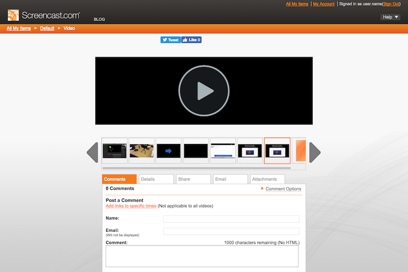
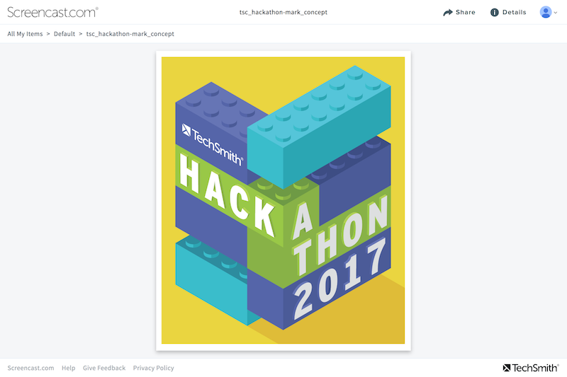
The View Page accounts for most of Screencast’s usage, so it was important to get it right. Over the years, the page became overly complicated. Usage data for the old page was pulled to understand which features needed to be surfaced better, and which could fade back a little.

Old design files were nowhere to be found, so I started designing directly in code, using React and CodePen, which provided some unexpected velocity. The development team decided to scrap this old page, and start from scratch using React — the prototype provided a solid starting point.
See the Pen Screencast View Page Wireframe v1 by Dario Corsi (@dariocorsi) on CodePen.
The prototype was tested to validate and refine the design. After a couple iterations, the page was introduced to the live product to gather real usage data and feedback.

The Library
The content management library is significantly more complex than the View Page, so starting from scratch wasn’t an option in the time frame.

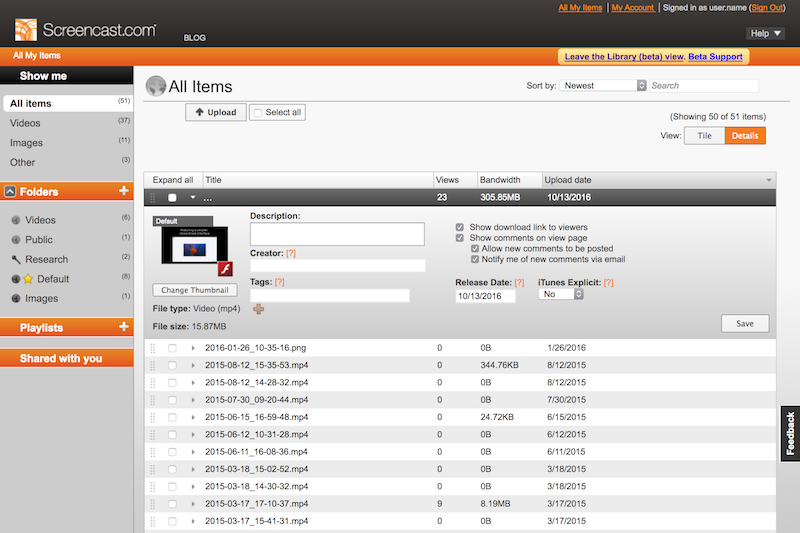
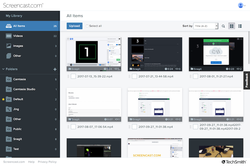
Two versions of the library existed — the original and the beta — so the first step was choosing one as a consolidation point. Neither was an ideal foundation, so the beta was chosen for its newer tech stack. After the decision, the five-year beta was officially over! But there was a lot more to do….
The beta library lacked some vital management features, so those were ported over. In addition to general polish, a few long standing, user-requested features were worked in.

Establishing a Feedback Loop
Time was tight, so large research efforts weren’t really an option. Still wanting to validate the work being done, a method for getting feedback in the live product was developed.
Optional Feature Switching
Users were presented an option to switch freely between the old and new features. If they chose to switch it off after trying it out, a poll was presented to get feedback and understand why. Valuable, site-wide insights were gained through this mechanism.
It was found that icon-only buttons were particularly difficult for this audience to understand. After adding text labels to buttons throughout the site, users were far more likely to stick with the new design.
An issue with title length was also discovered. Many users utilized file titles for organization, so a typical title was incredibly long. After increasing the maximum characters display for titles throughout the site, users were more likely to adopt the new library.
A weekly meeting was setup to parse and categorize all the feedback, which fed work for the next week. Iteration happened quickly, and the results were measurable.
Incremental Deployment with a Switch
After feedback slowed, the feature was switched on for waves of users. As long as feedback channels were quiet, more waves were opted in.
Final Feature Deployment
Final messaging was sent out, alerting users to upcoming changes, and feature switches were removed.
Feedback
There were hiccups along they way, but they ended up being opportunities to learn and improve the service. In the end, results were really well received. Longtime users appreciated maintenance to a service they use nearly every day.