Screencast Media Viewing Experience
- Year
- 2016
- Role
- Design Prototyping UX Front-end development

Overview
Screencast was introduced as the sharing destination for videos produced with TechSmith software. It quickly gained a loyal user base for its simple product integration, ease of use, and creator-focused hosting features.

The Problem
Due to a shift in priorities, the service was not actively developed for over five years. We learned from our public feedback channel that the product was failing to meet user expectations of a modern web application. We needed to modernize, or risk losing a significant revenue stream.
User Problems
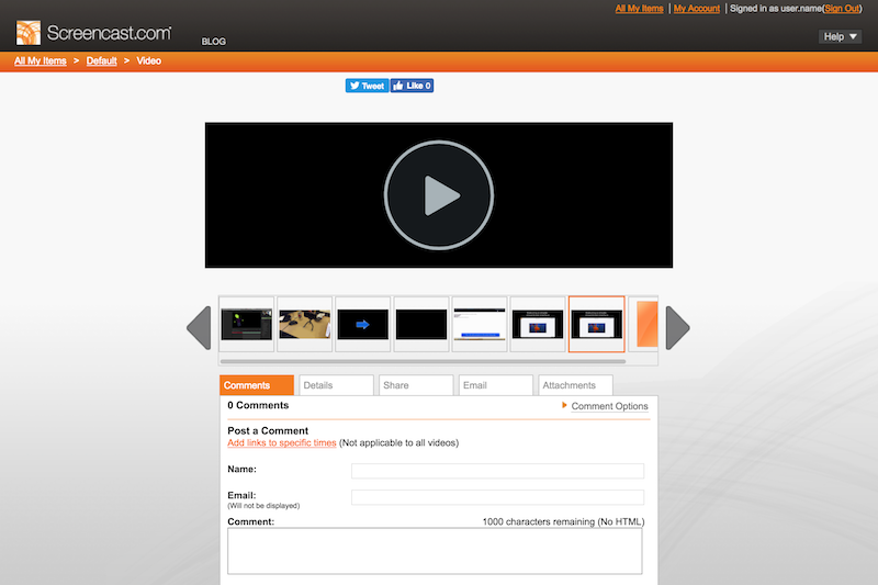
- Media page was not responsive, and did not render well on mobile.
- The service was visually stale/unprofessional.
Users and Audience
- Paid "Pro" Users
- Media Viewers
My Role
UX Research
- Understand how users were currently utilizing the service.
- Identify high value features that convert users from free to paid.
UX/UI Design
- Design responsive UIs that match user expectations of a modern web application.
- Make high-converting features more prominent in the interface.
- Update visual styling to be more professional.
- Increase visual cohesiveness with TechSmith desktop products.
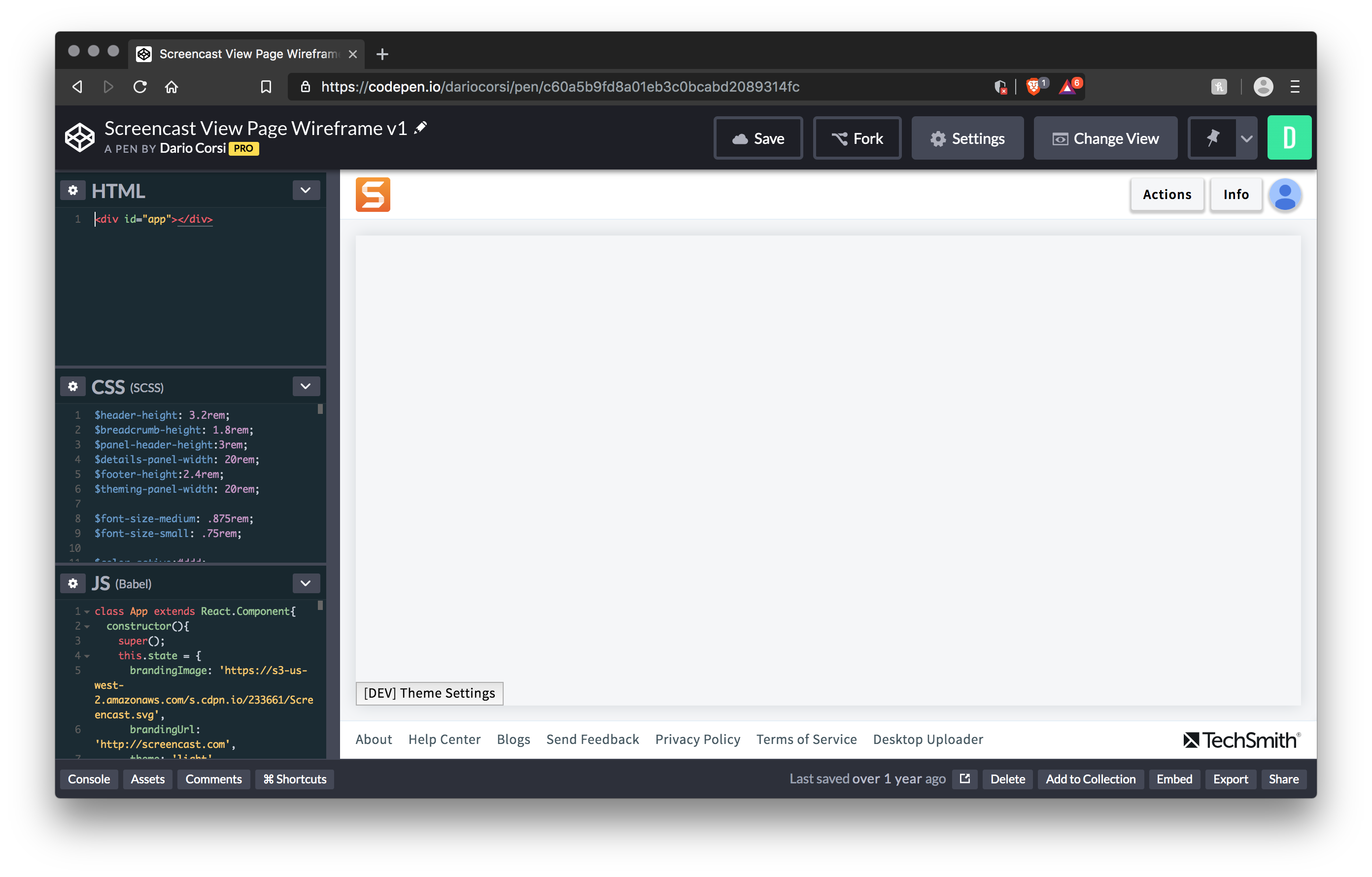
Prototyping
- Create high-fidelity prototypes to test and validate ideas.
- Accelerate development by contributing production-quality code.
Scope and Constraints
- The project was strictly timeboxed to six months.
- Much of the existing usage data was stale and unreliable. This meant more ad-hoc data collection during the design phase.
- We had limited ability to change workflows outside of the service, like exporting from the desktop products.
Process
Audit and Measure
- Audit existing analytics to understand where we need more data.
Design, Prototype, and Test
- Static mockups were refined through multiple rounds of testing with internal users of the service.
- A live prototype was produced to perform formal usability testing with external users.
Phased Deployment
We designed a three-phase deployment plan to deliver the new media page with as little churn to users as possible.
Throughout each phase, feedback was collected and parsed on a weekly cadence, which fed work for the following week. Iteration happened quickly, and we were able to measure our success through the quantity and sentiment of user engagement.
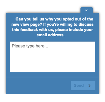
Phase 1: Optional Feature Switching
Users were presented an option to switch freely between the old and new features. If they reverted back, we presented a poll to gather feedback and understand why.
Phase 2: Incremental Deployment with a Switch
As feedback slowed, the feature was switched on for waves of users. As long as feedback channels were quiet, more waves were opted in.
Phase 3: Final Feature Deployment
Once there was a high level of confidence in the quality of the new media page, we messaged users about the upcoming changes to the service. The new watch page was then made live for all users, and we removed the switches to turn it off.
Results
Ultimately, we delivered the project on time, and with postive reception from our most critical users. Overall negative feedback dropped sharply after we shipped the new watch page.
Modernized Media Page
User Feedback
Fresh and Functional
"It took just a little while to get my bearings, but once I did, I was good to go. Overall, i like the design and the overall 'larger' UI elements. Makes it easier to work with on my smaller screen laptop."
Thanks for the redesign!
"I really like the redesign! I felt before like it was kind of a pain to navigate to my new items, now they're all right there, and uploading is much nicer too! Very straightforward to reorganize too, which I never got around to doing before."
Great new page!
"Love the new look and feel of the main page! Seems a bit more intuitive and professional overall."
Good new look
"Love the ease of use and the look, also the search function is great, saves a lot of time."
Lessons Learned
The project was successful, but it wasn’t without hurdles to overcome. Luckily we learned some valuable lesson from them.
- Survey placement affects feedback quality.
- Responsive ≠ mobile friendly.
- Opting-in to churn makes it more tolerable for users.
Questions?
Get in touch. I like feedback, opportunities, and design talk.
✉️ Message Me