Marketing Design System
- Year
- 2022-2025
- Role
- Project management Design UX Mentoring
- Output
- Figma Library Style guide

Overview
This was my second time creating and managing a large-scale design system from the ground up. While many of the lessons from my previous system (Cloud Services Design System) were applicable, such as accessibility best practices and the benefits of early collaboration, this system presented new challenges. These ranged from ensuring alignment across multiple teams and products to adapting to a fast-paced environment where design elements needed to evolve with marketing trends.

Problems to solve
Design consistency
A modern, intentional point of reference was needed to create consistency and brand recognition across multiple touchpoints, platforms, teams, and products. This would help reinforce the brand's identity and improve design efficiency by reducing fragmentation.
Accessibility
Building an accessible system was critical to ensuring that all users, regardless of ability, could interact with the brand's products and assets. Adhering to WCAG standards was essential, but the challenge was ensuring the system was flexible enough for both designers and developers to maintain accessibility as the system evolved.
Users and audience
- Designers: Primary users, using the system to build new experiences across various products and platforms.
- Writers: Utilize higher-level patterns to create consistent voice and tone across touchpoints.
- External Vendors: Contributing to different marketing efforts and needed to seamlessly integrate with the system.
- Millions of End-Users: Engaging with thousands of marketing assets, benefitting from a consistent and accessible experience.
My role
System management
- Identified opportunities for updating and refining elements within the system.
- Solicited input from stakeholders across design, development, and marketing.
- Collaborated with designers to implement the system in real projects, gather feedback, and integrate improvements.
UX/UI design
- Designed a cohesive visual style for components used across web products.
- Ensured all components were accessible and met modern design best practices.
- Monitored market trends to keep the system relevant while balancing brand consistency.
Coaching and advocacy
- Guided non-designers in using the system and helped them understand key design principles.
- Collaborated with developers to polish component styling and ensure ease of implementation.
Process
1. Audit existing interfaces
We began by conducting an audit of existing products and interfaces to catalog components and patterns in use. This audit helped identify redundancies and inconsistencies between different teams' implementations, which created friction in terms of user experience and development time.
- Reviewed and documented all components currently in use.
- Identified areas where design decisions were inconsistent or misaligned with brand guidelines.
2. Consolidate components
After the audit, we worked to consolidate similar components that served the same purpose but had different styles or slight variations. This was a key step in reducing complexity and creating a streamlined, scalable system.
- Grouped duplicate or similar components and standardized their design.
- Engaged cross-functional teams to ensure the consolidation aligned with user needs.
3. Design & build only what’s needed
With the consolidation complete, we focused on building only the essential components first. This approach allowed us to move faster and address immediate needs, avoiding the temptation to overbuild a massive system that wouldn’t be fully utilized.
- Prioritized the most frequently used components for redesign and development.
- Created reusable elements that could be applied across multiple products.
4. Deploy Incrementally

Rather than attempting a massive redesign across all platforms at once, we deployed components in phases. This allowed us to roll out updates in a controlled, non-disruptive way while gathering feedback from stakeholders.
- Introduced new components on a per-project basis.
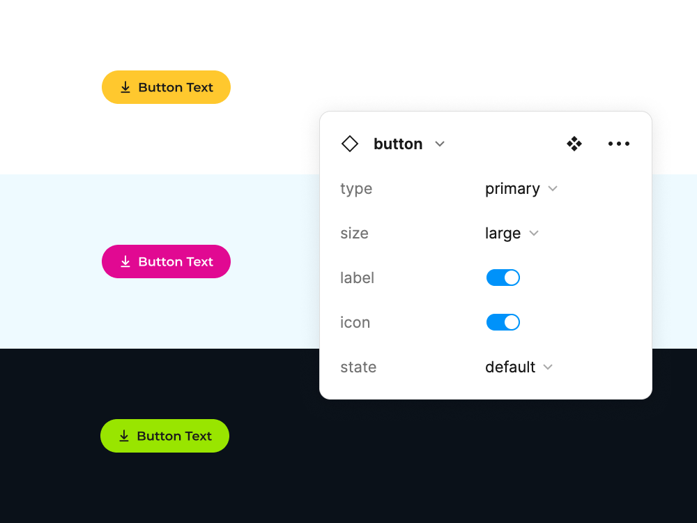
- Made high-visibility updates first, like global changes to buttons and form elements.
- Continued to monitor and adapt based on feedback from real-world implementation.
5. Iterate and expand

After deployment, we continued to iterate on the system, expanding it based on feedback and emerging needs. We added new components and patterns as the organization’s design requirements evolved.
- Solicited ongoing feedback from users and stakeholders to refine the system.
- Added more complex patterns and features that addressed specific use cases.
Results
Shared design language
The system created a cohesive and consistent design language, reducing redundancy and improving efficiency. It provided a single source of truth for teams to reference, leading to faster design and development cycles.
An inclusive, useful system

By focusing on accessibility and collaboration, the design system worked well for a wide range of users, including marketers with little design experience. This made it more inclusive and valuable to the organization.
A canvas for innovation
The system not only standardized design but also provided flexibility for innovation. Teams could build upon the foundational elements, allowing for creative freedom while maintaining consistency.
Next steps
Our goal is to keep evolving the system to meet the demands of a dynamic marketing environment. Unlike a design system for consumer software, marketing systems tend to have a shorter shelf life and require more frequent visual updates to stay relevant. Moving forward, we will focus on maintaining flexibility to adapt to trends without sacrificing brand integrity.
Learnings and thoughts
Build what you need
It’s tempting to design an exhaustive system from the outset, but a smaller, more focused system is often more practical. As the project grew, we found that only a subset of the system was used consistently, which reinforced the importance of designing with immediate needs in mind.
Design systems are an easier sell
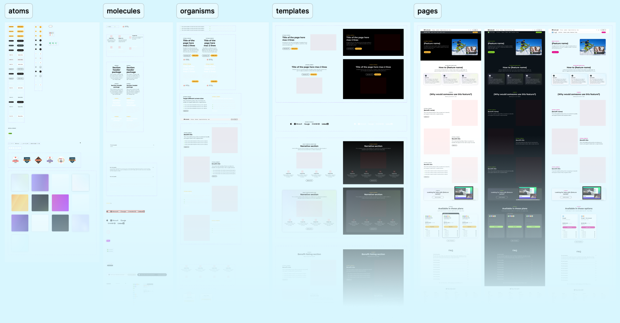
Since my first experience with design systems, there has been a shift in the industry. We're now in a post-Atomic Design era where design systems are not only accepted but often expected. This time around, I found myself educating more than defending the need for a system.
Modern tools make a difference
Working with Figma, which is designed with systems in mind, was a game changer. Features like components and variables significantly improved efficiency, allowing us to iterate more quickly and maintain consistency.
Collaboration is key
Involving stakeholders from the start and consulting with them throughout the process reduced resistance to changes. By building a shared understanding, we ensured the system was embraced by all teams.
Test with a buddy
Having another designer test and use the Figma library revealed blind spots that I may have missed. Doing it alone is possible, but it takes longer. This helped ensure the system was truly intuitive and effective for others and sped up design.
Naming things is still hard
Naming conventions can be surprisingly challenging. Philosophical debates about terms like "surface" vs "fill" are fun, but the goal is to land on language that is inclusive and clear for everyone.
Questions?
Get in touch. I like feedback, opportunities, and design talk.
✉️ Message Me