Cloud Services Design System
- Year
- 2017-2022
- Role
- Design Prototyping UX Front-End Development
- Output
- React component library Figma library

Overview
The cloud division of the company is responsible for signicant experimentation. Many of the experiments don't grow into products, so polished interfaces are not always a priority. However, a push to consolidate some cloud products under a shared platform illustrated just how inconsistent the design had become.
The Problem
Design inconsistency is bad for designers, developers, and — most importantly — end users. Whether you’re building the product or using it, a lack of patterns increases the cognitive load for every task. As our design team and product portfolio grew, better tools were needed to create cohesive experiences.
Users and Audience
- Designers and developers of TechSmith Cloud products.
- Customers of TechSmith Cloud products.
My Role
Product Management
- Champion the adoption of shared styles and components.
- Solicit input from stakeholders.
- Facilitate contributions and continued development.
UX/UI Design
- Design a cohesive visual style for components across all web products.
- Build upon existing desktop product styles.
- Consider best practices for accessibility.
- Increase visual cohesiveness with TechSmith desktop products.
Prototyping/Development
- Prototype interaction patterns and animations.
- Work with developers to polish component styling.
Scope and Constraints
Short Timeframe to Prove Concept
The cloud design system started as my project for innovation time, a two-week stretch between ten-week development periods. The project demo needed to be fleshed out enough to communicate the value, and get further investment from the business.
Lack of Dedicated Resources
Even after the product had buy-in, it did not receive a dedicated team. It was moved forward by interested parties in their free time.
Build on Desktop Product Styles
Often, our web products are designed to support our desktop application users. So the components introduced should match desktop visually.
Process
Audit Existing Interfaces
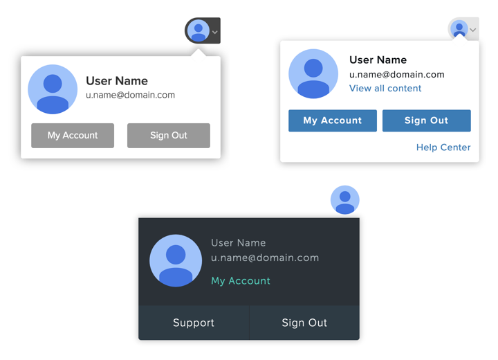
Web UIs were parsed through, element-by-element, to catalog existing components and patterns. This created a good starting point to determine what needed to be consolidated, expanded upon, and built from scratch.
Collaborate
We formed a working group of cross-platform designers to assess each pattern and element. It could take multiple sessions to get through a single topic, but the conversation itself was incredibly valuable in creating shared understanding.
Record Decisions
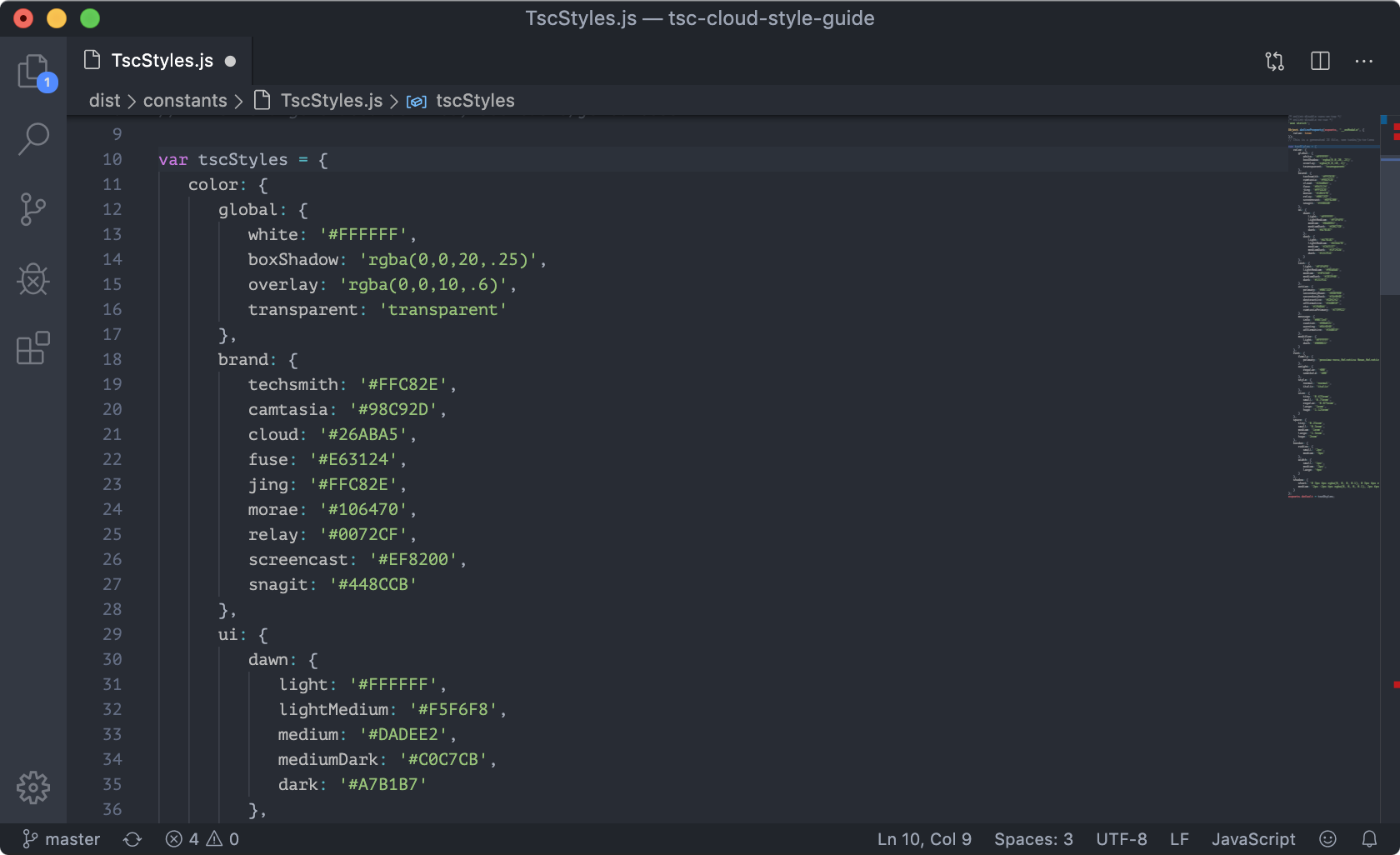
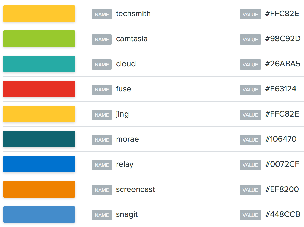
At this point, React was my go-to tool for prototyping, and was also becoming our preferred front-end framework for cloud projects. It was the obvious choice for creating a simple app to record and demo our component. This approach had multiple benefits, and likely contributed to the success of the project:
- We were able to pull the live components into other projects via NPM.
- No inconsistencies between static mockups and live components — the app was the source of truth.
- Helped get developers more involved in the design process.
Results
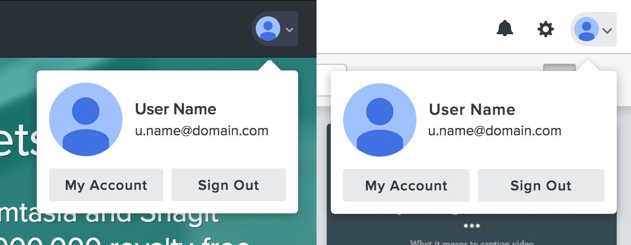
Improved Consistency
Elements started to look the same across products. And since we were using a common repository, improvements to components could be pushed globally.
Accelerated Front-End Development
The back and forth between designers and developers decreased, and sped up feature development as a result.
Shared Language
Designers, developers, and stakeholders gained a consistent way of talking about design. This helped cut down miscommunication.
Continued Growth
The project still sees frequent contributions and enhancements.
Lessons Learned
Collaboration Helps with Adoption
People seem less resistant to change when you consult and involve them.
Tooling Choice Affects Participation
Consider the audience for your project up front, and choose your tools accordingly. Choosing React and GitHub for our documentation was great for developers, but was alienating to some designers.
Questions?
Get in touch. I like feedback, opportunities, and design talk.
✉️ Message Me